People seem to struggle to determine what a presentation really is.
What the hell is a slide anyway?
They can easily describe what a page is, or a spreadsheet document, but a presentation is still hard to define. We’ve gotten so used to overcrowded, endless, boring slides, that we might have forgotten the very purpose of a presentation - and basically, that is the main reason why we created Slidebean -. Truth is, a presentation is merely a visual aid to support your speech, and transmit an idea to someone else. Therefore, there’s no ideal scheme of what a slide should contain, as long as it helps you to clearly convey a particular message (hence: clearly).
Slide Ingredients
So, what can/should be used to create a slide? There’s a great deal of data that can go into a presentation, which doesn’t mean all of it is suitable for such purpose. We’ll focus on three of the most common elements: Text, images and charts.
TEXT
The main issue when addressing text is how much is enough, and when to stop. Most presentations derive from previous materials, like page documents, and because of that people tend to go a little overboard when adding information to a presentation. The main issue with this is that if a slide is full of text, people either ignore it completely in order to listen to you, or worse even, ignore you in an attempt to read what’s written. Best advice we can give you is do NOT type *everything* on the slides, rather, use only keywords to help the audience (and yourself) keep up with your story. Keep text to an absolute minimum.
IMAGES
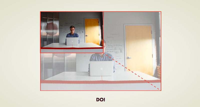
DO NOT use stock photos of people at a meeting room, posing towards the camera, nor any clip art of characters solving a puzzle, or the absolute worse: two guys in suit shaking hands. Not only does it look absolutely hideous, but no one can relate to those images. They are super fake and make you look like a really bad presenter. Check out these great sources of photos, so you don’t have to use them ever again.
Another mayor issue comes when resizing images. Spare your viewer's eyes the pain and always keep proportions.
Related read: 6 Presentation FAILS you need to start avoiding
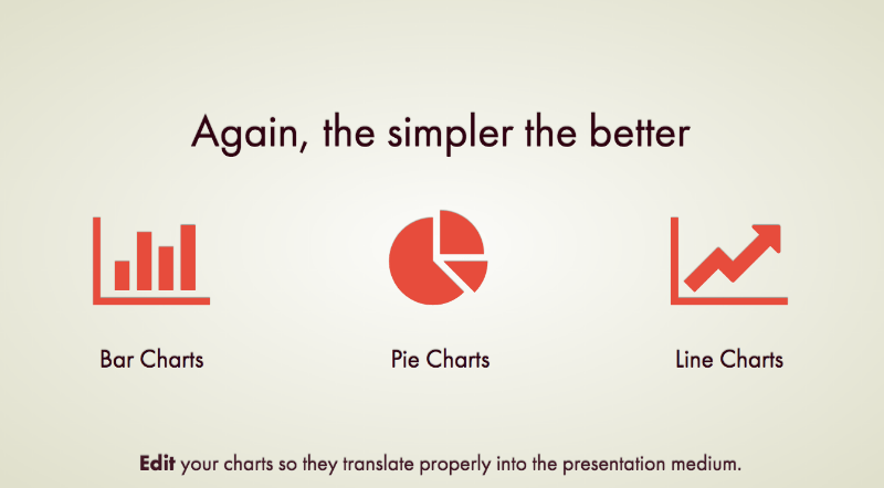
CHARTS
The simpler, the better. A great chat is not one that has a ton of data but one that represent what you're explaining in a clear way.
COMPLEX DATA SETS AND OTHER MONSTERS
The reason for the name is complex data sets were never meant to reach the presentation medium. They take too long to understand. Due to their complexity, the font becomes too little, and therefore they are pretty much impossible to read from the audience perspective. So the answer is: DON’T.
LAYOUTS, COLORS AND FONTS
Layout tips:
- White space is a great thing! Don't feel the need to fill it.
- Columns: 1 is great, 2 as well, 3 tops, 4+ avoid.
- KISS: Keep It Simple Stupid
COLORS
A great way to manage this is with a color palette. Here are places where you can find some cool color palettes:
- Adobe Color CC (color.adobe.com)
- Paletton (paletton.com)
- Adobe Color CC > App (capture color from surroundings)
You don't even know what kind of colors to use? Don't panic! And know all about Color choosing for presentations.
FONTS
“Whatever you do DON’T use default fonts in your presentation. They just say “I did this presentation in a hurry”
I'm guessing that's not the impression you want to send. Below I'm leaving you some alternatives to default fonts:
- Open Sans
- Alégre Sans
- Poiret One
- Helvetica Neue
- Raleway
- dafont.com has a lot of cool & free fonts
You might also want to check out another of my articles: Best Times New Roman Alternatives: Fonts to Avoid Default Fonts.
I hope you found these tips useful. Go ahead and try them out in your next presentation.
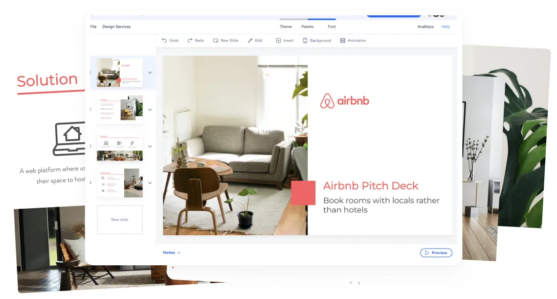
WEBINAR:PRESENTATION DESIGN 101
This was part of a webinar I hosted las week. Check out the presentation I used for it below and also see the recording of the webinar.
This post was originally published May 18th, 2015 and has been revamped and updated for accuracy and comprehensiveness.


Let’s move your company to the next stage 🚀
Pitch deck software
Pitch deck services
Start a project
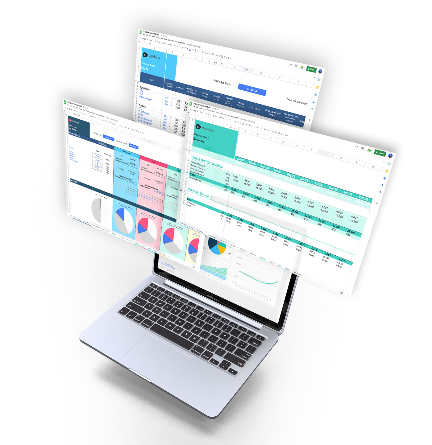
Financial Model Consulting for Startups 🚀
Raise money with our pitch deck writing and design service 🚀