This is the Uber pitch deck used to raise their first round of funding, back in 2008. I think it's a fantastic example of a perfectly defined problem/solution combination: so obvious it's surprising nobody else saw it before them.
Now- I've always said ideas are worthless without execution, and I stand by that... but well, this was a multi-billion dollar idea.
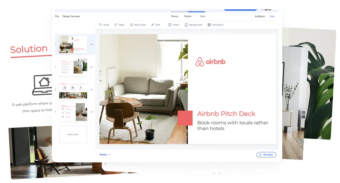
Now the slides certainly look very 2008. Or very 1999. Anyway, we took the liberty of running them through our AI presentation design tool, so you don't have to endure Arial.
Here's Pitch Deck Examples- a teardown of the Uber Pitch Deck.
The structure of the Uber pitch deck
Cover
The Problem/Solution Section, which is made up of
- Problem
- Medallion System (or Problem Part 2)
- Solution: Uber Concept
- Solution: 1-Click Car Service
The Product Section, digging deeper into the features:
- Key Differentiators
- Operating Principles
- Apps
- Website
- Use Cases
- User Benefits
- Environmental Benefits
- Fleet
- Initial Service Area
- Tech
- Demand Forecasting
Market and Go-to-Market Section:
- Market Size
- Composition of Market
- Target Cities
- Potential Outcomes (an amazing slide)
- Smartphones
- Future Optimizations
- Marketing Ideas
- Location-Based Service
And finally, Traction.
If you try to match this deck to a 'standard' pitch deck template, you'll notice how the Product section is vastly extended, as well as the market analysis and go to market slides.
The 'exception' on this pitch deck, is that back in 2008 Uber's proposal was VERY new. It's understandable for it to require additional slides for investors to grasp it.
Now, on the other hand, I must highlight how each slide has only a small amount of text. These aren't 25 overcrowded slides, but rather, each slide touches on one specific topic with just the right amount of information.
The Uber Pitch Deck Problem/Solution Section
The cab experience was undoubtedly broken, and this is the opportunity they saw.
Notice that there are only two main statements on this problem slide:
- Using aging and inefficient technology- both for the radio and for the cars themselves.
- Hailing is done using 90's methods: hands and phones- not taking advantage of the now widely available GPSs.
The problem is extended to another slide, dedicated to the Medallion system, a clearly broken system.
For the Solution, the sentence I have to highlight is 'Convenience of a Cab in NYC + experience of a professional chauffeur.' Let's recall the first version of Uber was closer to what we know now as 'Uber Black.' If you rode an Uber in the early days, the experience compared to a Cab was vastly superior.
Both of these slides could have been enhanced with product screenshots, but the company was still in an idea stage at this point. Which, as I've said before, doesn't give you high chances at raising capital. Remember, this was over ten years ago - check out our video on the traction requirements for raising money in 2019.
Product Section
Again, since there was no app to show, each feature and piece of functionality had to be explained. I would have replaced many of these slides for a step by step diagram, showing the process of hailing an Uber or telling 'the story' of calling a regular cab vs. calling an Uber. Don't listen to me, I suppose, we're not the $72B company.
A challenge I often see founders face is the ability to summarize everything they have in their minds into a few sentences.
These Key Differentiators and Operating Principles slide is a great example. To me, they can be condensed into a single slide.
Both are referring to Uber's 'Competitive Advantages,' which is a slide most decks should have... but here's how I would have solved it.
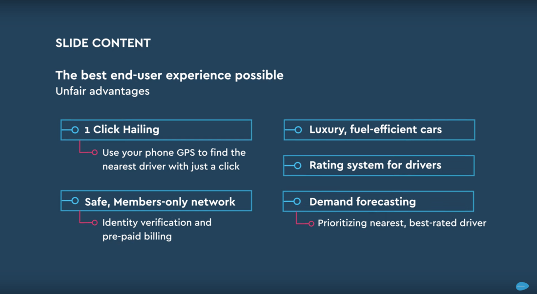
I don't believe I missed any crucial details, but I was still able to summarize this into a single slide, which is way more impactful. We often fill the need to add more, when we should focus on making sure every single sentence in there counts.
Now the Go-To-Market Section
The market size should put the company size into perspective. In this case, this Uber pitch deck used the US Taxicab market as a reference, a $4.2B opportunity.
To put this into perspective, Uber reported $11.27B in revenue in 2018 over 3x more than the whole US market. The answer is simple; Uber quickly and effectively became a global brand.
Were the founders aware of the potential the company had? Maybe they weren't.
They added an interesting 'Potential Outcomes' slide, which is not common in the pitch decks I've come across. They envisioned the best-case scenario as a $1B+ yearly revenue market leader. For good, or worse, not even the founders themselves new how big this company would become. Or maybe they knew and chose to stick to a more conservative, believable and sellable story.
So, Uber became a world leader, it paved the way for other companies like Lyft to follow, and there's still room to grow. They are even looking to move into self-driving cars! Though none of this info is in the pitch deck.
If a 2008 investor saw an adjusted Uber deck projecting what they were about to become, my guess is they wouldn't have bought it. I think it's a great lesson to learn about learning how to project your company on the deck.
Finally, they had a traction slide at the very end. Not a lot; but these were different times. I've always said it, and I'll say it again, you need traction to raise funding.

Let’s move your company to the next stage 🚀
Pitch deck software
Pitch deck services
Start a project
Financial Model Consulting for Startups 🚀
Raise money with our pitch deck writing and design service 🚀