Creating presentations is usually a time demanding process, and beyond that, it's frustrating for a lot of people.
The fundamental problem with presentations is this: when you are creating a slide, you are concerned about the content of that slide, and at the same time, you are worried about the layout.
While you type in your title and your bullets or bringing in your charts, you are being distracted by the font not being right, or the elements misaligned, and this is just incredibly distracting. It's the main reason people waste hours on PowerPoint.
In this article, I am going to cover:
- 42 presentation ideas for defining the content of your deck
- Presenting professionally
- Creating memorable slides.
42 presentation ideas:
1- The first and most important tip I will give you today is, focus on the content FIRST.
2- Don't even open your presentation platform until you've solved the content- and do that in a distraction-free place, like notes.
3- Think of a presentation as a story, I think most presentations are and this applies even more to pitches.
The introduction to the story should talk about:
- The problem
-The status quo
-How things aren't working.
Your company/product/service comes in to break the status quo; it overcomes difficulties, and finally, once the audience is in awe, that's when you sell.
Even a boring company report could be told as a story. How the company struggled, how the competitor/antagonist tried to outsmart you, and your team outwitted them to become victorious. If you work on a plain text platform to write the deck, switching this around is a lot easier than going back and redesigning slides.

4- As you write the slides, make sure that each slide only talks about one point. One idea per slide! You can use charts and other elements to reinforce the idea, but it should only be one idea.
5- For each slide, do your absolute best to stay below 100 words or around 500 characters. Any slide above that will look overcrowded and trust me; people don't read them.
6- Remember, slides are there to illustrate the point you are making. If you are waking someone through a deck and your deck overwhelms them with information, they will either pay attention to you and ignore the deck or, worse, try to read the deck and ignore you.
7- Even if you are sending the deck over email, stay below the 100-word limit, because chances are your reader is not going to stop to read everything. We have the data to prove it.
8- Don't be afraid to allow your audience to breathe by separating your sections with a clean slide. If your status quo section is five slides, don't be afraid to add a breather slide to begin the new section.
9- Some shmuck came up with the rule that you should limit the number of slides. Forget it. Thirty clean slides are way better than ten overcrowded slides.
10- What you should learn to limit is the time you spend on the deck, not the number of slides. Practice; set up a timer and go through your slides as you will the day of the presentation. If it took you 10 minutes on rehearsal, that is going to translate to 15 minutes the day of the presentation, so always leave some breathing room.
11- If you are spending several minutes on a single slide, considering splitting that slide into more slides to keep the audience refreshed. Every change of slide is an opportunity to get the audience's attention back.
12- Related to that, make sure you look at people in the eye- especially those who are distracted or falling asleep. Eye contact with the presenter forces you out of those Reddit memes and back into the presentation.
13- You mustn't think of your presentation as a script. I've seen it done, and it never works. I spoke at a TEDx conference a few months back, and I'll never forget one of the presenters had a literal script that he recited word for word. First, the audience will tell, and second, if you forget a sentence, you are lost. He had a script prompter hidden behind the stage, just in case.
14- Personal stories are great to engage with the audience. Just learn to tell these stories with only the necessary number of words.
15- Instead of a script, use the slides as a reminder of the topic. Can't remember what you should be talking about next, well, just change the slide and there's your reminder.
The slides are a tool for you as well as the audience. And once again, if you overcrowd them, you'll be tempted to read them. Don't. The headline and the <100 words you added should be enough.
16- Not everyone is comfortable speaking on stage, so think of your presentation as a conversation. Practice by presenting to a group of 3 people, and start adding more. Think of it as telling a story; it makes it easier.
17- I'm a firm believer that a confident speaker is better than a rehearsed speaker. You'll see many speakers, including world leaders, using rehearsed hand gestures, or being extremely aware of maintaining their posture. On the contrary, I look to behave casually: leveling with the audience. I've sat on the edge of the stage if I want the presentation to be more casual and horizontal.
18- Also, know your tech. Be prepared for HDMI, vs VGA (I still see those, incredible), vs wireless or remote presentations (you know, coronavirus times).
19- If you present often, buy your own remote. They are cheap and provide a far better experience to the viewer that you being stuck to your laptop. Slidebean also lets you use your phone as a remote, so, you know, even better.
20- Also related to tech, take advantage of the presenter notes screen. Most platforms have them, and they let you see what slide comes next, monitor how much time you have left, and read the notes you left on the slides.
21- Notes are useful to remind yourself of the points you need to make. Make sure you don't add three paragraphs in there, because in the middle of the presentation, you won't have time to read. Do large, bold keywords instead.
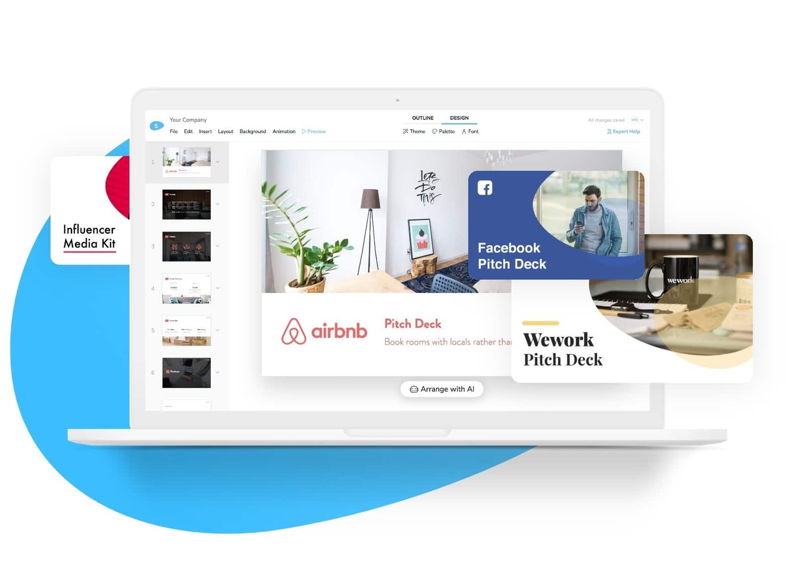
Useful resource: Slidebean presentation templates
.jpg)
Alright, let's get into the slides themselves.
22- Less is more. Don't feel the need to decorate the slide. If an image is necessary to make the point, go ahead and add it. If not, only words are just fine.
Look at platforms like Medium.com. It's minimalistic, with no color, but an absolute focus on readability. That is completely fine, and it breaks if you suddenly try to add three bar charts on a single slide.
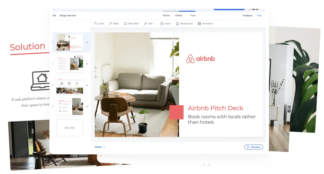
23- If you must use images, please don't use stock photos like these. The solution to this is called Unsplash, and it's perfect. Millions of royalty-free images that don't look like stock photos. Check our Unplash photo collection.
24- You can also illustrate the slides with icons. We use a platform called The Noun Project, which also has millions of icons. What's even better is you can download the icon in any size you want, without background and in any color you want, so you can make it match your presentation theme.
25- Speaking of theme, a color palette makes a world of difference. If your brand has a brand book, stick to it. Most brand books these days even include a replacement to black.
26- Black is a harsh color on a deck; most brands these days use a dark gray that blends better with the rest of their colors.
27- If you don't have a brand book to follow, try going to Adobe Color. It lets you browse millions of color palettes and pick the feel of the deck before you even start making it. Once again, stick to it.
28- NEVER, NEVER pick random colors from the color wheel or even worse, god-awful default colors from that Microsoft picker.
29- In regards to fonts, understand what fonts are for.
For body text, you can go with Serif, Sans-Serif or Slab fonts. Serif fonts are the ones that have the little serifs on their ends. They are typically used on formal documents and executive type presentations. Sans-serif fonts are more casual, but by no means informal. They are usually fresher and easier. Slab fonts are a new, popular trend that stands in the middle of these two.
30- For headings, you can absolutely use one of the previous fonts. You can mix and match or just use the same for everything.
31- If you want to be edgier, you can certainly go with more stylized display-type or handwritten fonts, just don't abuse them.
32- Please don't use Calibri. It's the default font on most Microsoft Office versions, and it reads- 'I didn't bother to change the default font.'
Another font crimes are Comic Sans, but hopefully, that's hidden enough, so nobody ever finds it again.
33- Moving back to design and imagery, consider using GIFs. They are fun, and they break the monotony in a long presentation.
34- As a broader tip, have fun with the content. Add little nods and pop culture references on your placeholders. We often put Breaking Bad or Lord of The Rings reference on our website and presentations, and we like to think people notice.
We are doing 42 tips in this video to upset our competitor, and because 42 is the answer to life, the universe, and everything. Google it if you don't believe me.
35- If you need to add mockups, we recommend trying out placeit.net. They have a fantastic platform where all you do is upload your logo or your screenshot, and they automatically place it on a device, a t-shirt, or a mug.
36- Let's talk about some don'ts no. Don't close your presentation with a Thank you slide. DON'T. There's no need. Don't waste that opportunity to do a call to action or to show your brand. If you need to say thank you, say it, don't put it on a slide.
37- Please don't use laser pointers. They were a thing 20 years ago. If you need a laser pointer to refer to a specific point in your slide, that means your slide is overcrowded, and there's more than one idea per slide, which means you broke rule 4.
38- Don't make any text smaller than font size 16. That's too small for a presentation.
39- Watch out for color contrast. Remember, you might be presenting on a projector, which might not be bright enough to display colors that are too similar.
40- If you must use video, embed it on the presentation and make sure that you selected the correct timestamp from Youtube. You don't want to be scrolling through a video while presenting. Also, make sure that your video is not longer than a couple of minutes.
41- Engage with your audience. People like to have conversations. For example, ask them what other tips they would add, and tell them to drop them in the comments, I mean, raise their hands.
42- Last but not least, you can re-watch this video, try to memorize these tips, write them down--- or just use Slidebean.
We quite literally started this company so that people wouldn't have to worry about all of this. Everything from the character limits, to the color palettes, the storytelling structure, and the images and icon resources are all integrated into the platform.
Slidebean is free to sign up, and you get one free month on our premium plan by signing up here.
Also, if you have an existing presentation, you'd like our team to redesign, we can help- just click here: Slideben Design Services.


Let’s move your company to the next stage 🚀
Pitch deck software
Pitch deck services
Start a project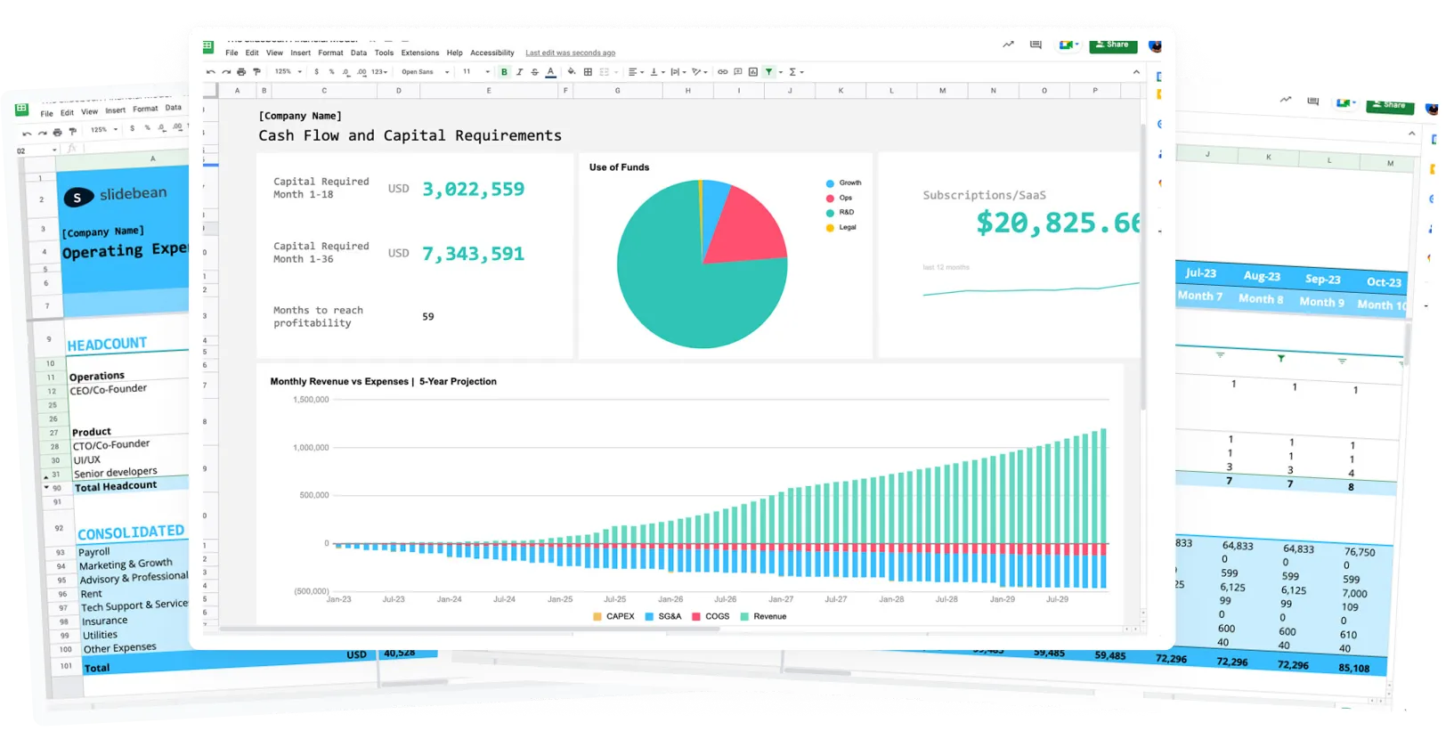
Financial Model Consulting for Startups 🚀
Raise money with our pitch deck writing and design service 🚀