The New York City subway map is one of the most recognizable pop culture references of the 20th century, visible in all sorts of random objects, from mugs and coasters to shower curtains.
Cracking the NYC Subway - The Good
This design was the work of Massimo Vignelli and Bob Noorda, who worked for years to improve the mess of a system the NY Subway has become.
“For the first few years, they spent hours underground, watching the flow of passengers getting on and off trains and moving through stations. They studied their habits. Where did they go? Where did they look for information?
Over the years, many different companies had been commissioned to provide the underground signage, and so directional signs competed with one another in terms of size, typeface, use of abbreviations, and in many cases, even lighting.
In Noorda’s own words, “their system was a mess.”

They didn’t just design signs, they designed a system. They rethought the way people used the subways and turned their concept into a system that is admired by designers everywhere and is the backbone for many other subways around the world. They gave the system its sans-serif typeface (the sign-makers could not yet print Helvetica, so they settled initially for Standard Medium), a clean, easy to read font.
Fonts you should never use - The Bad
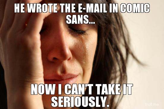
To me, Calibri is one of the ugliest fonts ever invented by humankind, I hold it up there with other design fails such the infamous Comic Sans MS.

Using Calibri for a presentation or a document speaks almost too much about you. It tells us that you didn’t bother to find a better font for your doc, or even worse, that you thought it looked good.
Other fonts along those lines, Lobster, Brush Script, Papyrus, Bradley Hand and, God forbid, Lucida Handwriting.
I've been ranting about these fonts for a while, but not all is lost. Here are some Calibri Alternatives you can use, as well as Times New Roman Alternatives.
Calibri Alternatives - The Tip
So the tip is obviously around fonts you CAN use, and better yet, for FREE! Here are three of our favorite picks:
1) Open Sans, by Google. A simple Sans-serif font that adapts as its being integrated on websites all over the world. I’m sure you have recognized it.

2) Alégre Sans is a beautiful, sans-serif capitalized font that we find particularly attractive for headers. It's like a beautiful version of IMPACT, but still... impactful.

3) Raleway is another Google Font; this one represents a great free alternative to Helvetica Ultralight. It was designed originally as a lightweight typeface and later evolved to add new, bolder variants.
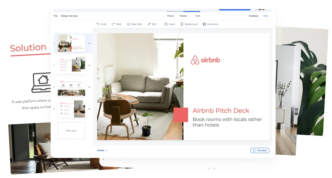
TRY THESE FONTS ON SLIDEBEAN
Let’s move your company to the next stage 🚀
Pitch deck software
Pitch deck services
Start a project
Financial Model Consulting for Startups 🚀
Raise money with our pitch deck writing and design service 🚀